Version 3.0
I am very pleased to announce that version 3.0 of ServicePlanner is now available.
There are a number of new features in this update, but the underlying focus was on stability and usability. ServicePlanner as been out for a while and certain features of the app needed to be taken to the next level, and other features needed to be made more intuitive, especially for new users.
At a high level these changes include:
- Up to 5x “Other Hours” categories supported.
- The ability to set a max limit on other hour credits (current default is 75 hours).
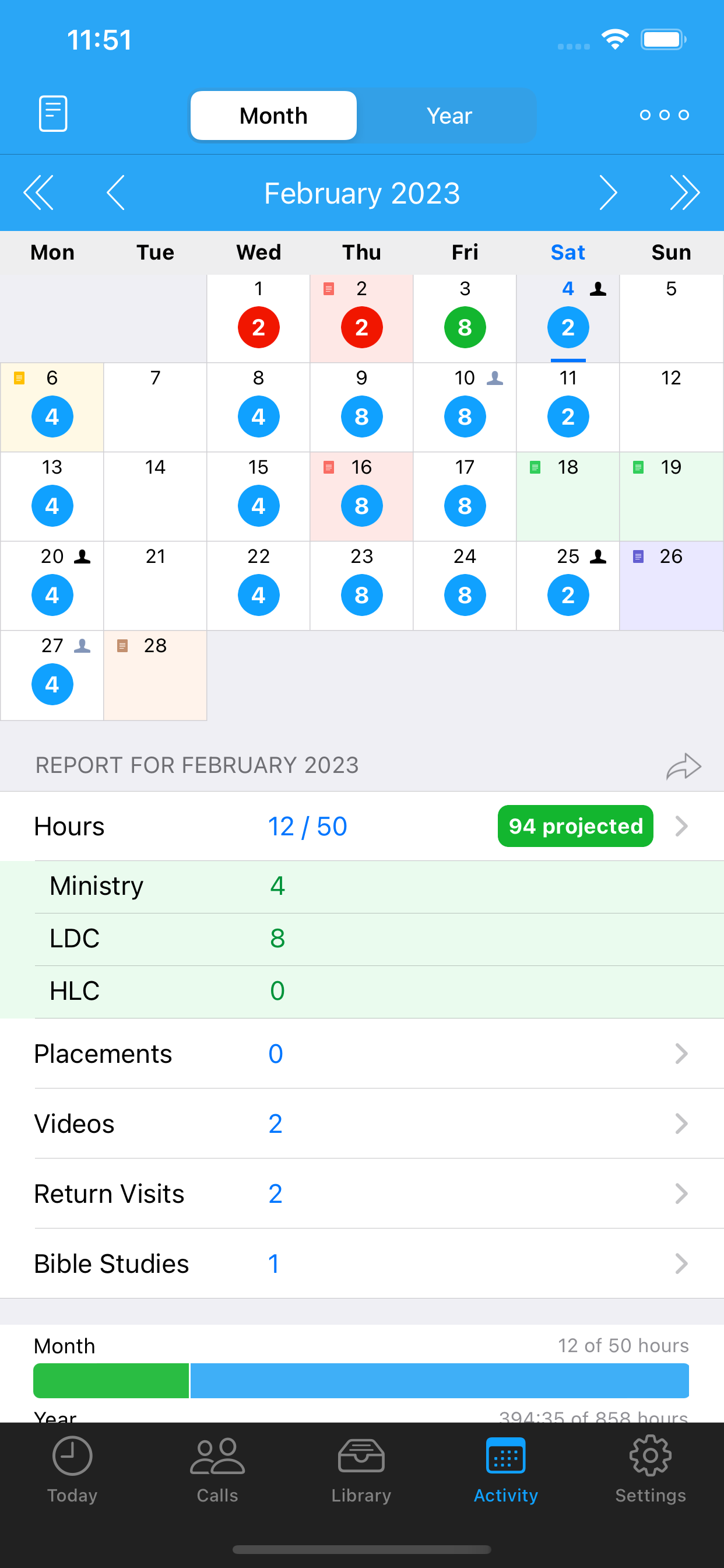
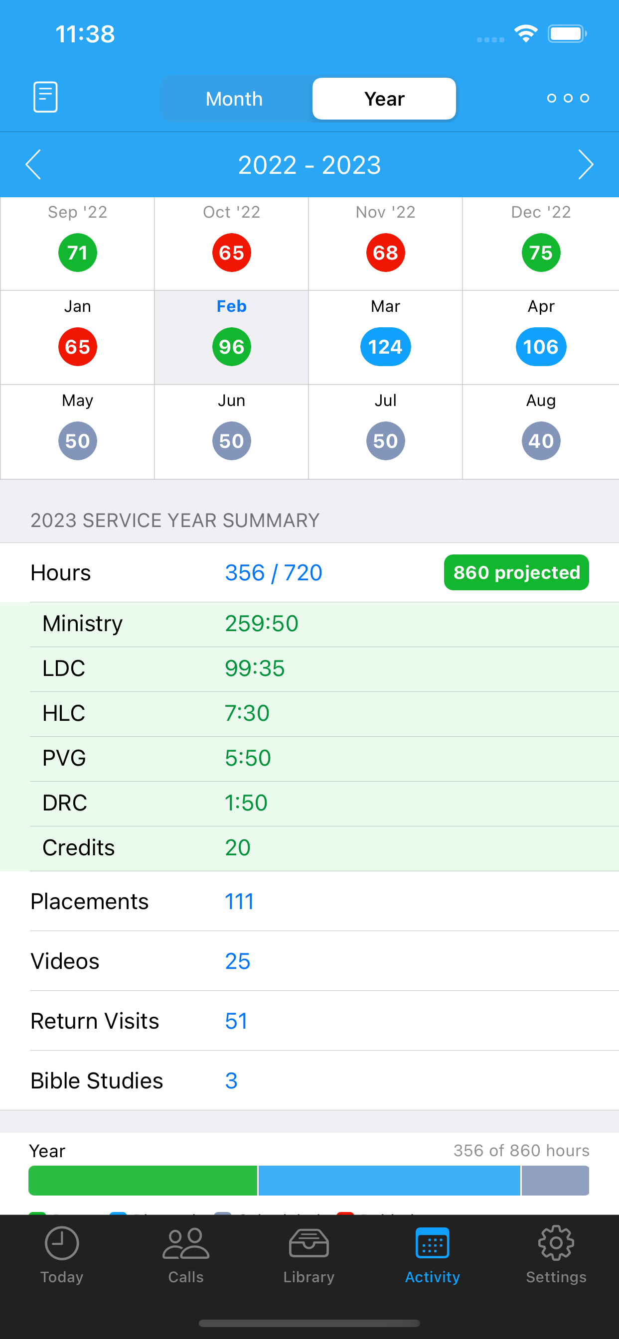
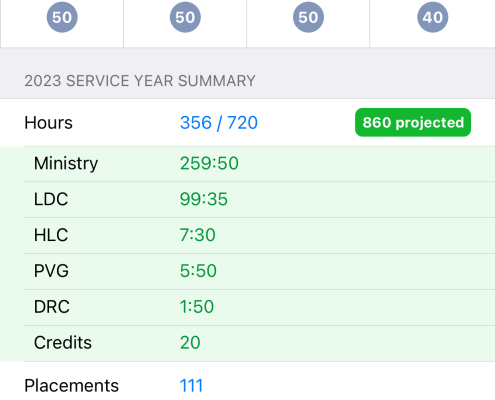
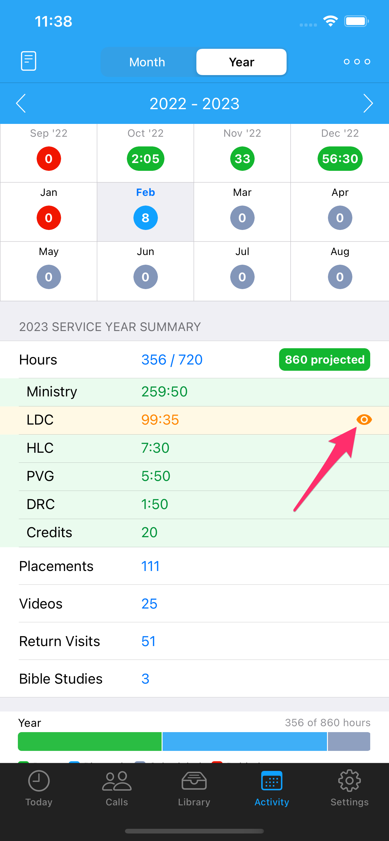
- Visibility of the different hours on the Activity Calendar and Report (Month and Year).
- Multiple enhancements to the daily Notes in the Activity Calendar.
- A new Contact Type was added … and the ability to rename the Contact Types in the Workflow Settings.
- A new Visit Type was added … see details below.
- New users will now have some default publications and videos added.
- Simplification of the Video and Publication screens.
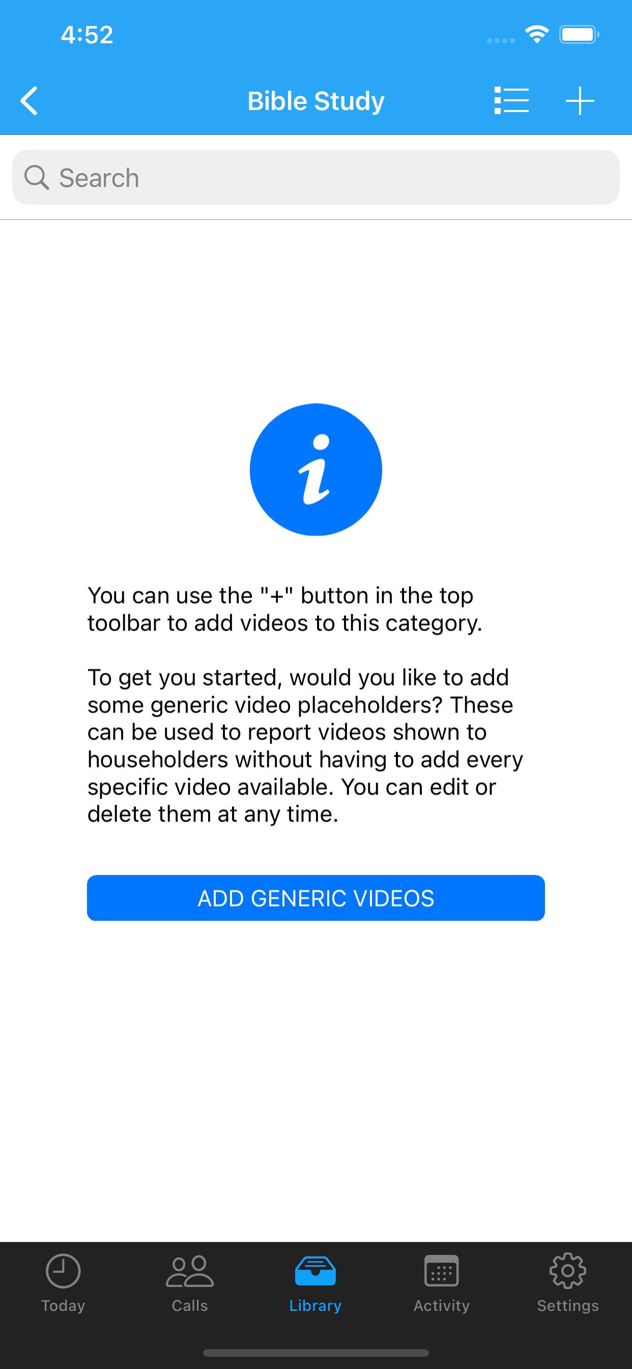
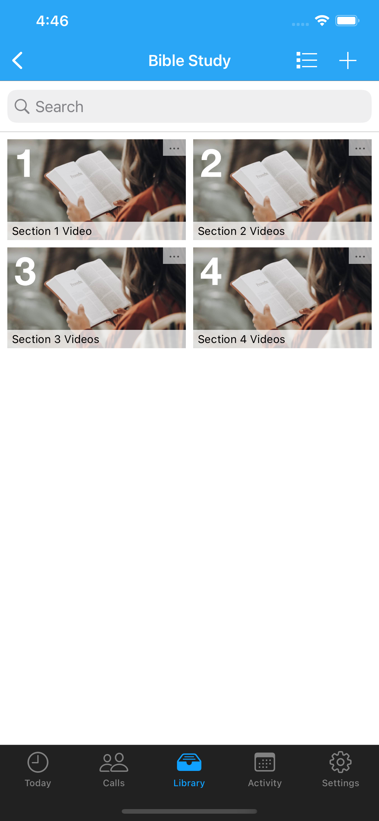
- A new “Bible Study” videos category.
- Improvements to the Dropbox Sync.
- Better support for Emoji in things like Tags, Contact Names, Saved Filters and more.
- Official support for Chinese Simplified and Traditional.
- Contacts no longer require an address.
- There are new Contact Filter options.
- And so much more.
Let’s now review the changes made in detail…
Enhanced “Other Hours”
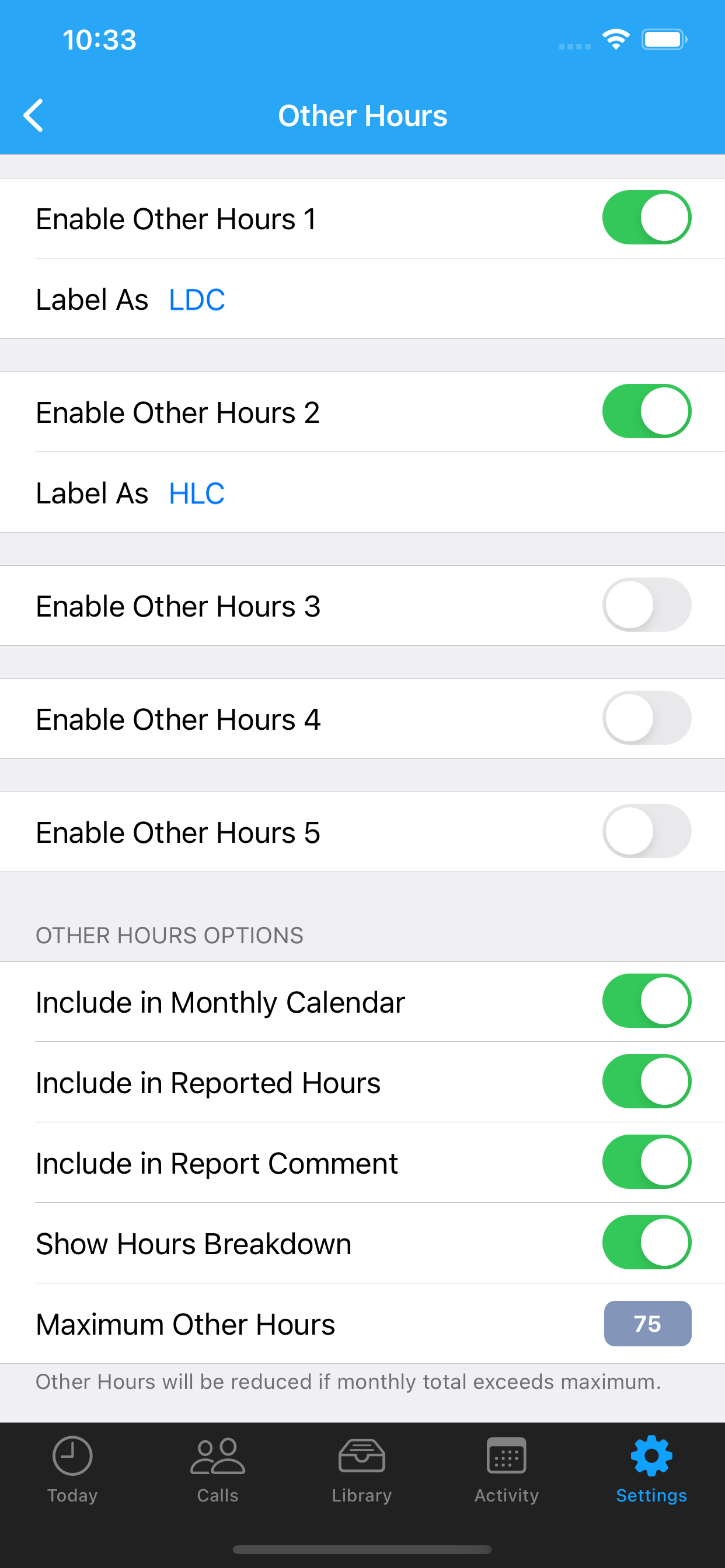
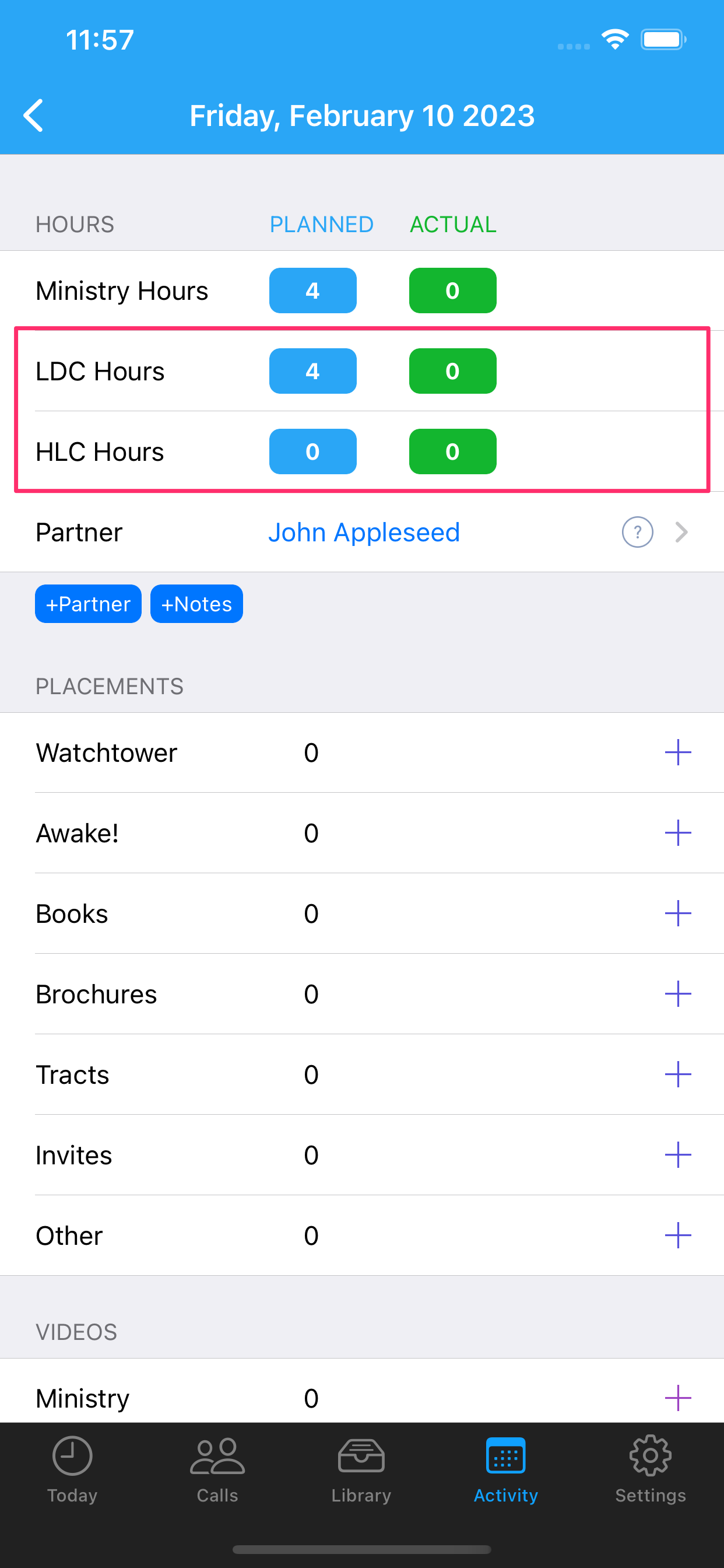
This is probably the area with the most feedback from existing users. Many were using the existing “Other Hour” category to schedule and report the time they spend on spiritual activities such as oversight or training assignments, LDC, HLC, PVG, PID, DRC and more … gotta love all the acronyms! Many are working hard in more than one of these assignments and need to record their time separately. As a result version 3.0 adds the ability to enable up to five different “Other Hours” categories of time.
You can also now set a limit on the number of Other Hours that get added to your time. So if you are a Regular Pioneer, your ministry time + total other hour credits cannot exceed 75 (you can change this at any time). If your ministry + other hours exceeds the maximum of 75 ServicePlanner will take care of everything for you on your report.
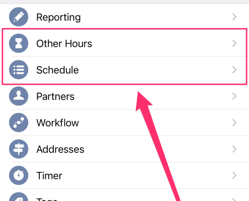
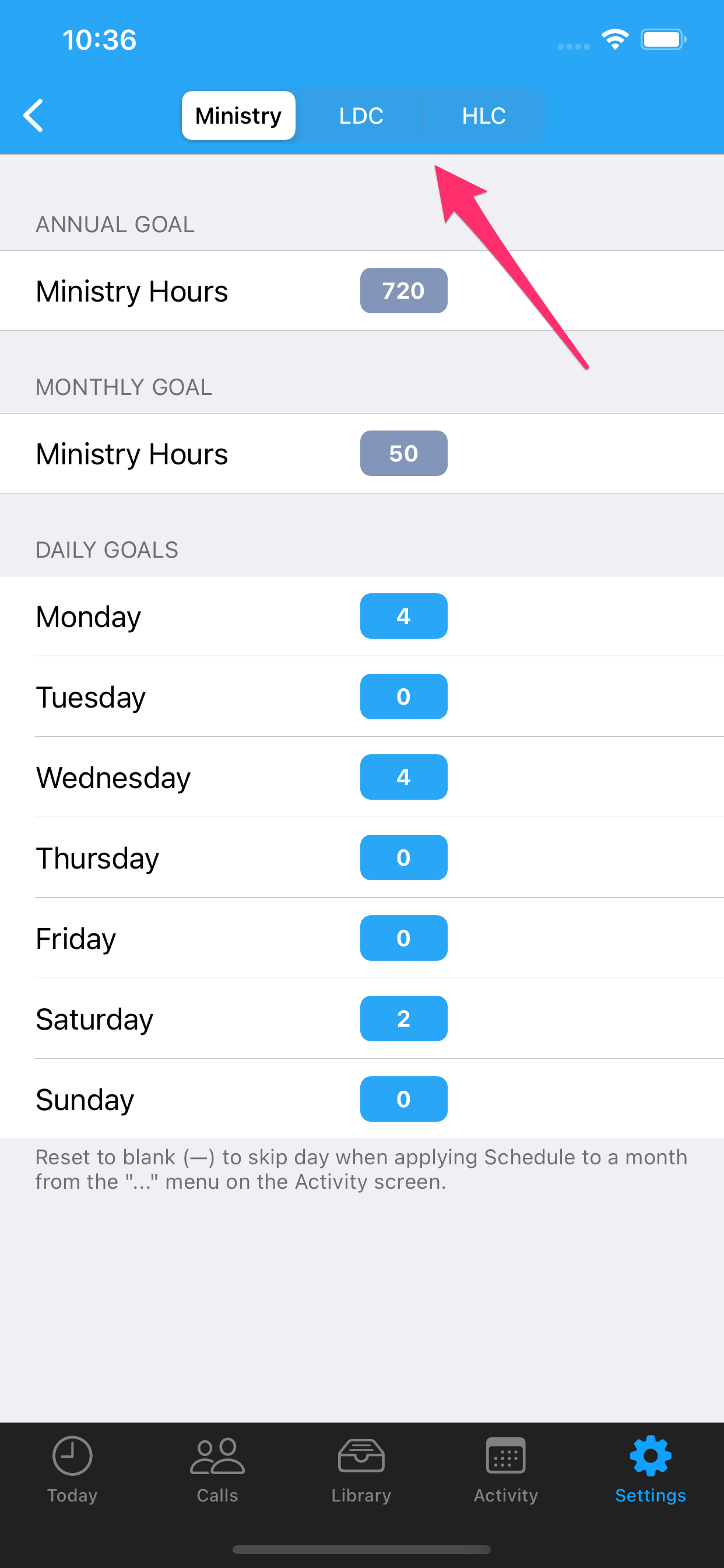
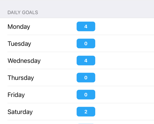
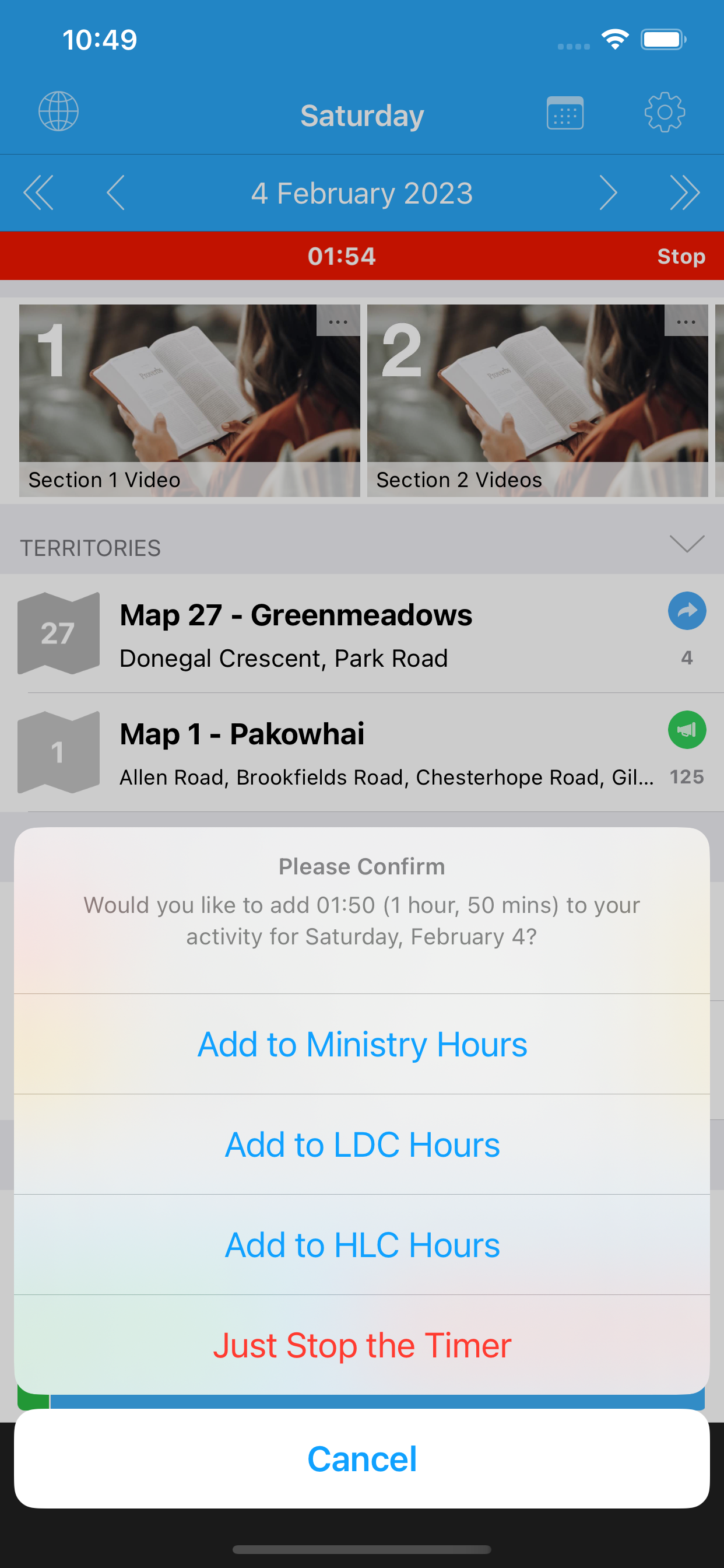
Check out these screenshots for an overview of what is possible in the settings now:
Each of the 5x Other Hour categories allows the following:
- Rename the category. Spaces in the name are now allowed.
- You can setup a Schedule for each category. For example if you do LDC work every Thursday and Friday, you can schedule those hours and apply it to your month when organizing your schedule.
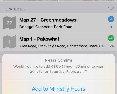
- If you use the Timer, you can log time against any of the enabled categories.
For the overall other hours being reported, you have different settings:
- Include in Monthly Calendar – controls if the Other Hours are included in the hours showing each day on the Calendar. If you disable it, only Ministry hours will be shown. The Other Hours can still be visible in the report hours breakdown however – which is another new feature covered in the next heading below.
- Include in Reported Hours – control if the Other Hours get included in your final report for the month.
- Include in Report Comment – provides a description of the Other Hours per category at the bottom of your final report. Depending on your assignments some will choose to disable the “Include in Reported Hours” but turn on “Include in Report Comment”.
- Show Hours Breakdown – this is a new feature covered in detail under the next heading.
- Maximum Other Hours – set a limit on the maximum number of ministry + other hours you can report. ServicePlanner will automatically keep your other hour credits below this threshold on your report.
Other Hours and the Activity Calendar
It is all well and good having 5x other hours categories, but previously all the hours were just lumped together as a single amount on the Activity screen. Users suggested showing each hour category inside each day on the Calendar but that was not realistic on smaller screens – and especially now there can be 5 different categories enabled. Hopefully the following changes retain the clean look and feel but also are an intuitive way of solving this challenge…
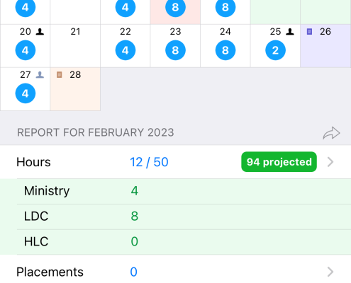
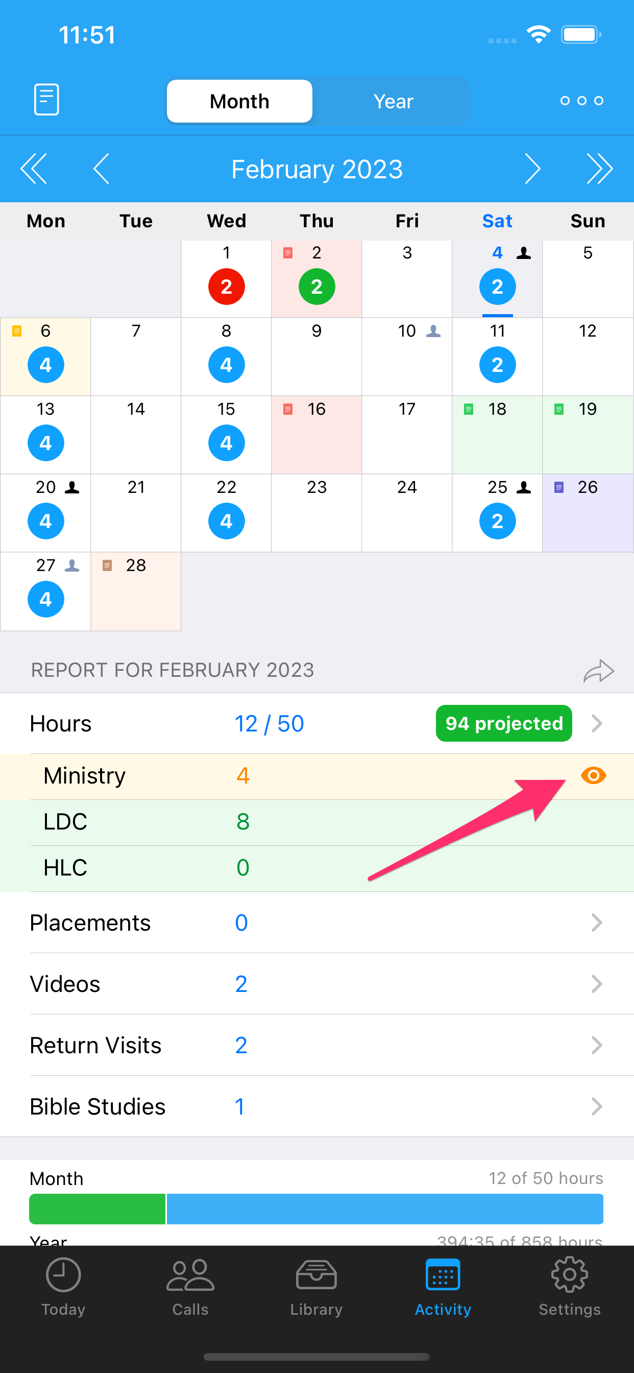
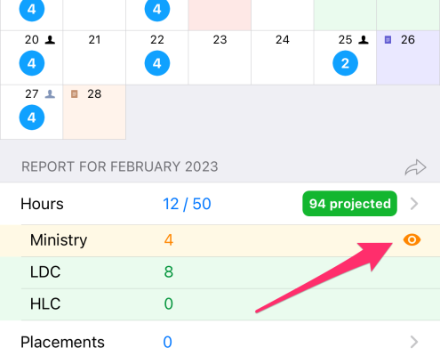
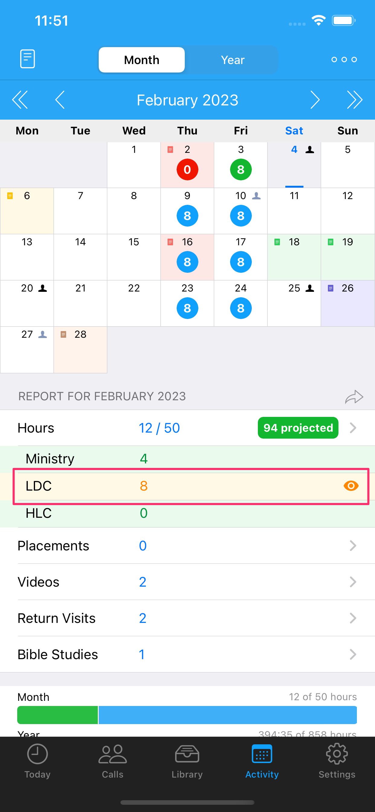
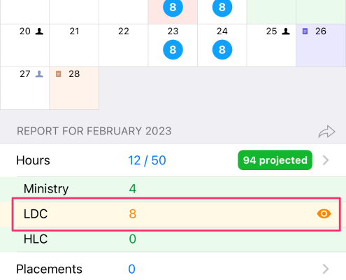
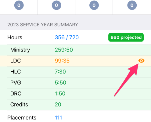
Notice in the screenshots how the Report now includes an Hours Breakdown. This will only show if 1) You have at least 1x Other Hours category enabled and 2) You have the “Show Hours Breakdown” option enabled in the Settings.
If you click on a line in the Hours Breakdown report, the Calendar will only show the hours for that selected category. This is true on both the Month and the Year calendars.
Daily Notes
I did not expect so much attention on the notes that can be recorded against each day in the calendar. It has surprised me the different ways users are utilizing this feature, and the types of feature requests that have come in around this. For example the ability to include daily notes in the end of month report, and the summary list of notes inside the Hours detail screen, were both feature requests from users.
I am pleased to take this feature to new heights!
- You can now select a color for the daily notes. The color will then be applied to that day on the calendar.
- There is a new Notes window accessible from either the toolbar button top/left, or by a long-press on the Activity window.
- The Notes summary shows all notes from the selected month forward. You can filter by color, search, swipe to clear the note, or tap on a note to jump to that day.
- If you have chosen to include notes in your Report, you can now specify which color notes to include.
Here is a demonstration of some of these features…
Workflow and Contact Types
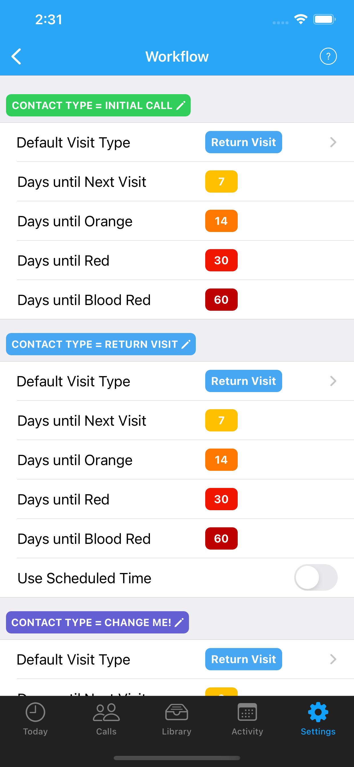
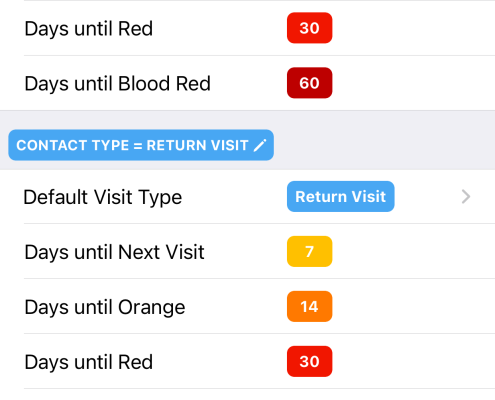
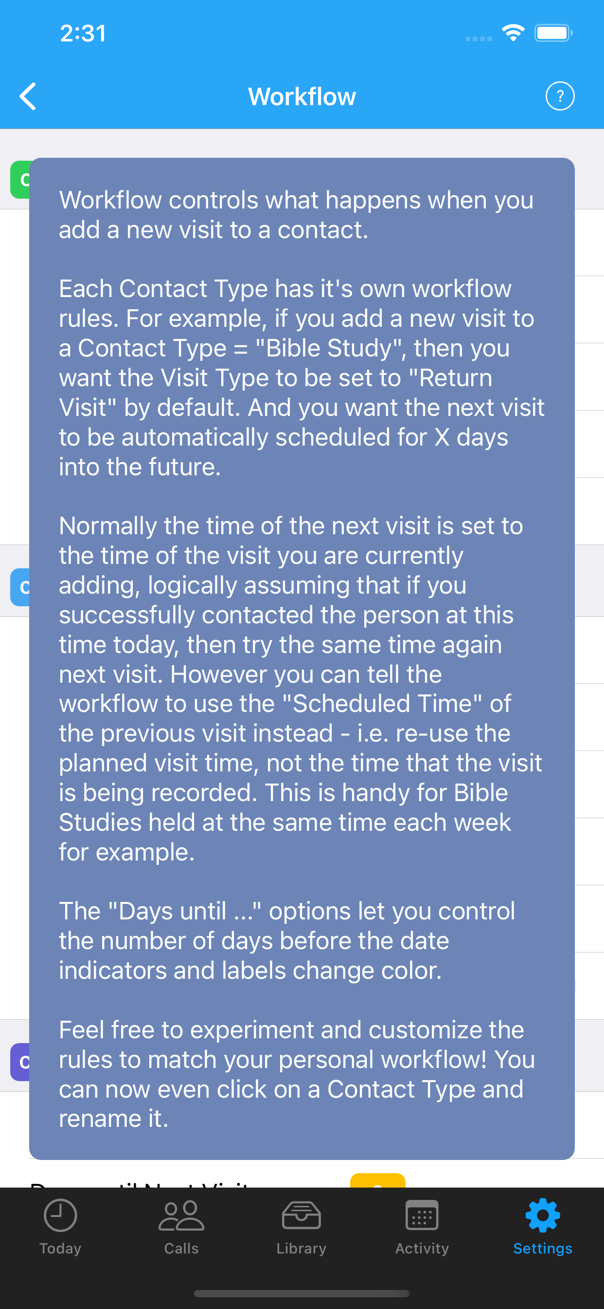
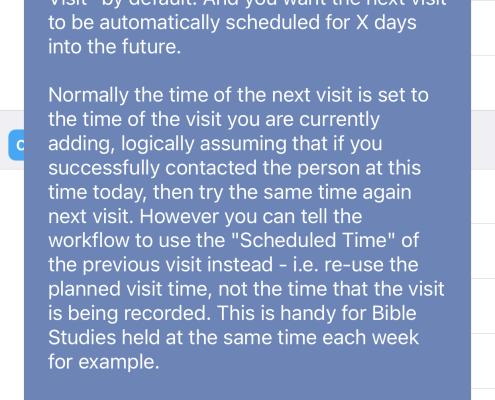
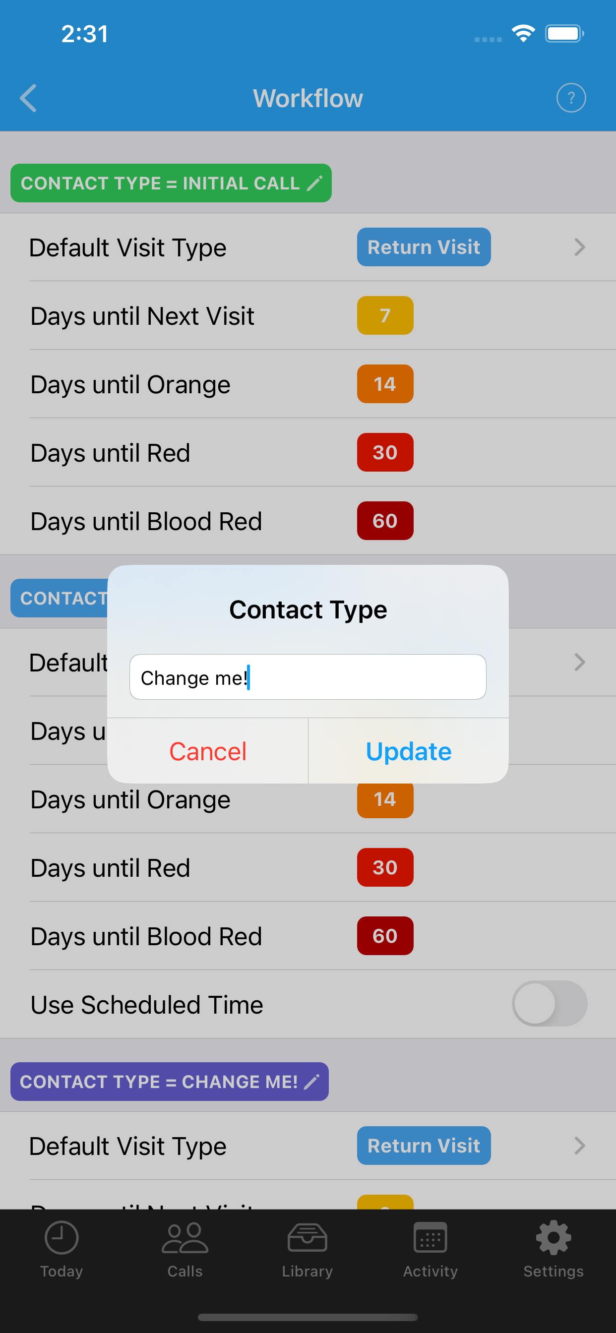
ServicePlanner is optimised for the process of recording interest found in our territory, and streamlining the workflow of returning on interest. Users can tweak the workflow in settings, but it is a relatively advanced process to understand and generally users don’t play with these settings until they have used ServicePlanner for a while. There is now an overview of the workflow available in the settings screen, and the screen has been optimised to hopefully make things a little more intuitive.
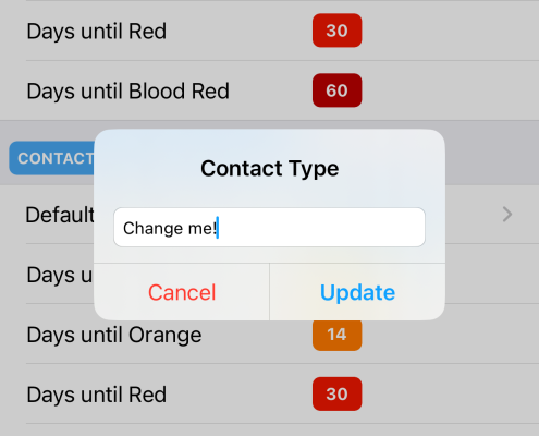
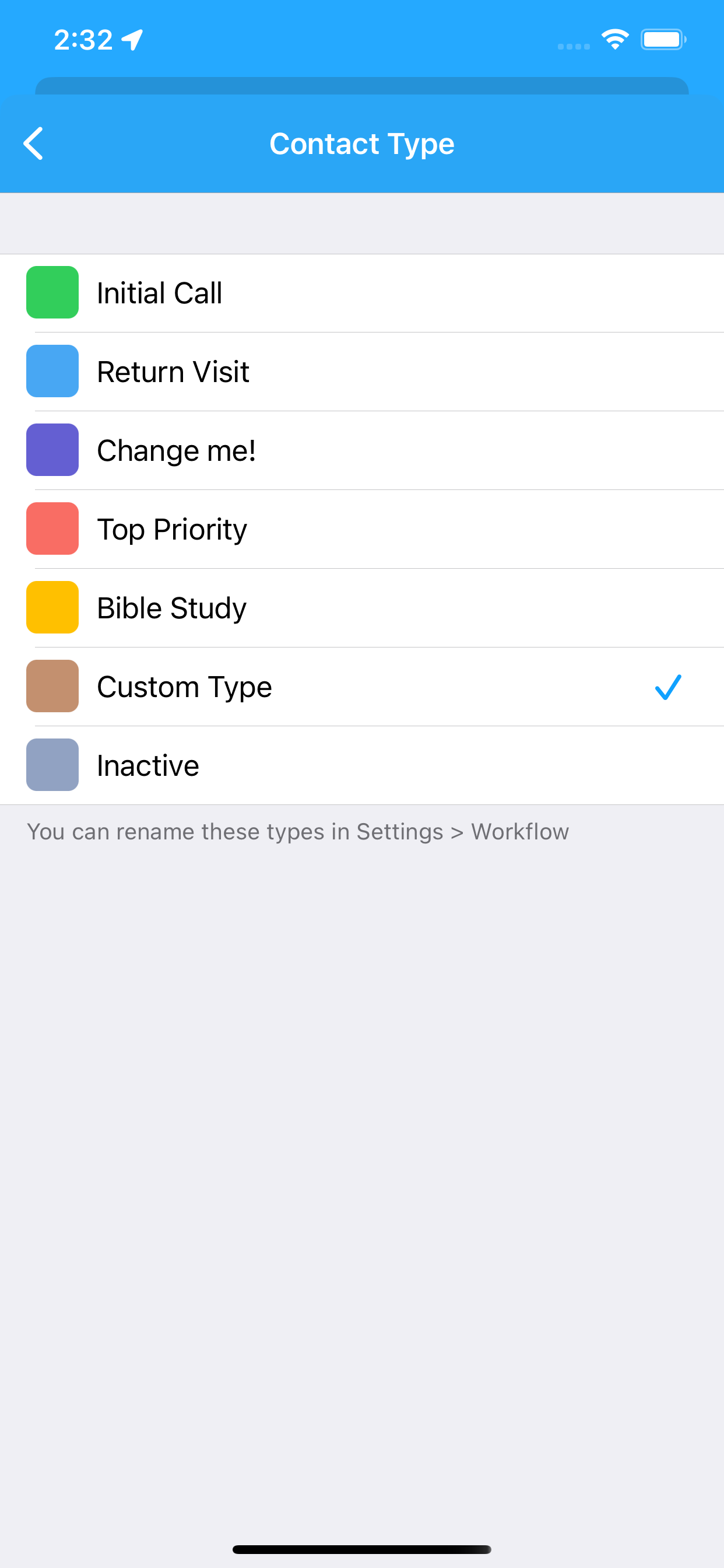
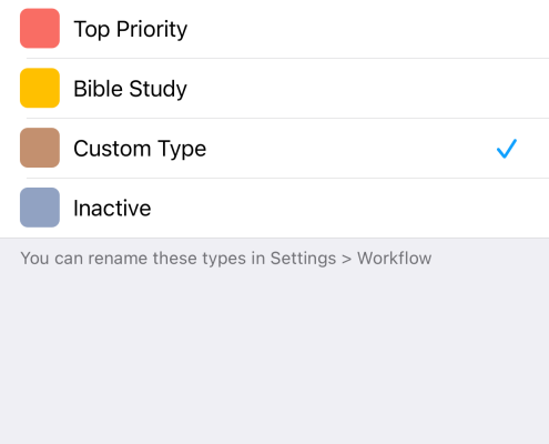
One of the things you may notice on the above screenshots is that the Contact Types have a pencil icon ✎ indicating that they can be edited. And that is correct! You can now change the names of the default Contact Types to reflect your personal requirements. Yes that’s right – you can finally change the “Magazine Route” type to be called something else! 🎉 I also added a new Contact Type called “Custom Type” for your convenience (I know sorry, had a mind blank there 😂) .
New Visit Type
There is a new Visit Type called “Secular” (meaning “non-religious”). This allows you to record a conversation that is not recorded on your report as a Return Visit … but you still communicated with them and want to remember what was discussed.
While in this area I also renamed “First Call” Visit Type (and Contact Type) to “Initial Call” to better reflect the terminology we use in the Workbook.
New Contact Filter Options
The Contact Filters are perhaps the most advanced feature of ServicePlanner that most users don’t seem to look at. The button is relatively prominent in the toolbar at the top/left of the Calls screen! Please have a look sometime 😀
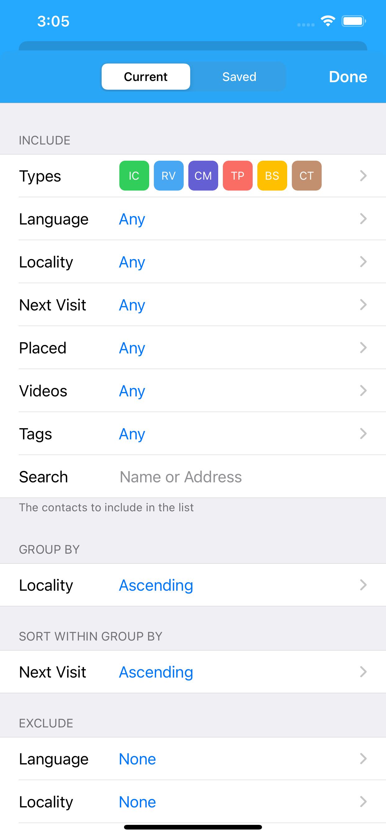
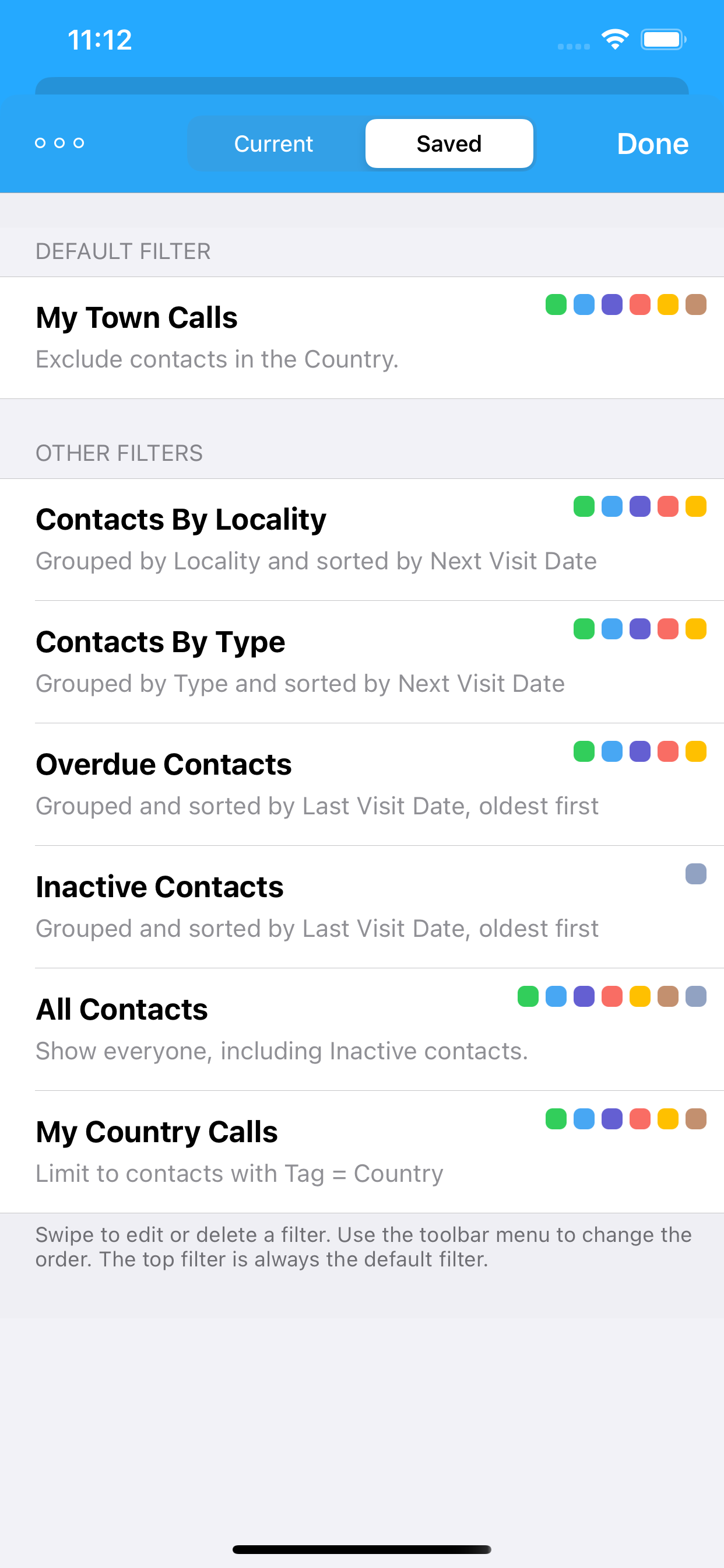
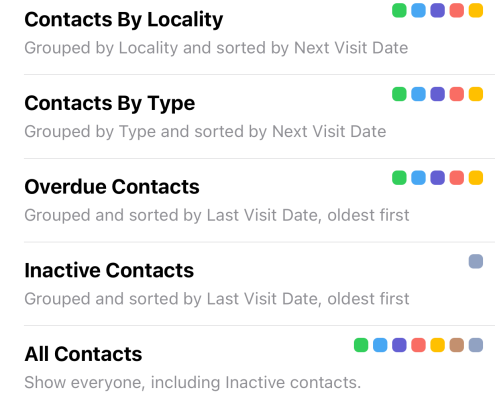
Filters control the list of Contacts – who is showing in the list and how they are grouped and sorted. You can change the options, and then create a new “Saved Filter” so you can easily re-use that search criteria again. There are already some Saved Filters for you to use – such as the “Inactive Contacts” filter – useful to show all the contacts that you didn’t delete but marked as “Inactive”.
The Filter Options now have some new criteria:
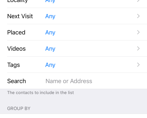
- You can now limit by “name or address”. Basically the same as typing a phrase into the search bar at the top of the list of contacts, but you can now save a search phrase into the Filter.
- You can now Group By “Next Visit” or “Date Added”.
- Tags search now includes AND|OR options:
- AND = the matching contacts must have ALL of the selected tags.
- OR = the matching contacts can have ANY of the selected tags.
- The new custom contact type is included in the filter options.
And hot tip 🔥 – you can long press on the Filter icon on the Contact screen to return to the default Saved Filter – that is the one at the top of the list of Saved Filters. And if you longpress again it will switch to the next one in the list, and if you longpress again it will return to the default filter at the top of the list, and if you longpress again it will return to the second filter. You get the idea! You can now longpress to switch between the top two Saved Filters.
Better Emoji Support
We often heavily use emoji when messaging others – but they are a very useful tool inside ServicePlanner as well. I have optimised the app to support them in a number of places, especially in a Contact or Tag Name.
Emoji Tips:
- Use emoji at the end of the Contact Name to indicate things like a Man 🙋♂️ / Woman 🙋♀️, Older Person 👵, Phone ☎️, Letter 📮, or whatever you like 💪. You then have visual clues in the Contact list that do not take up a lot of space and are easily searched for even using the new filter options (in addition to tags and the other features available).
- Use emoji at the start of your Tag names. You can then group your tags easily. For example I use 🌐 Language, or 💬 Preferred Contact Method, etc.
- I typically rename my Saved Contact Filters to use emoji as well – it is just another way to use them.
PS: I can’t include emoji by default in the app sorry as it breaks the Apple guidelines.
Publications and Videos
So this area of the app has been the most challenging for me right since version 1.0. I wanted to keep it simple, but I also wanted to cater for users (like myself) who are into the detail. The implementation allowed for all options – but it was probably not immediately obvious to new users that they could just take the lazy option and add high level publications and videos to record placements against – or they could go all out and add every single publication and insert cover artwork and more. On top of that, since the app was launched the amount of publications we typically work with out in the field ministry has drastically changed and simplified.
Version 3.0 provided an opportunity for me to step back and look at this area again. I am hoping the following changes provide a better balance of features for all user types (the “lazy” ones, and the detail oriented ones 😂)
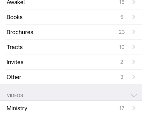
- New users will now have some default Publications and Videos enabled.
- The default Publications are limited to those in our Teaching Toolbox – 1x book, 2x brochures and 8x tracts.
- Only the publication name and abbreviation is added – no artwork or links or additional details. Users can add these extra details themselves if they want to.
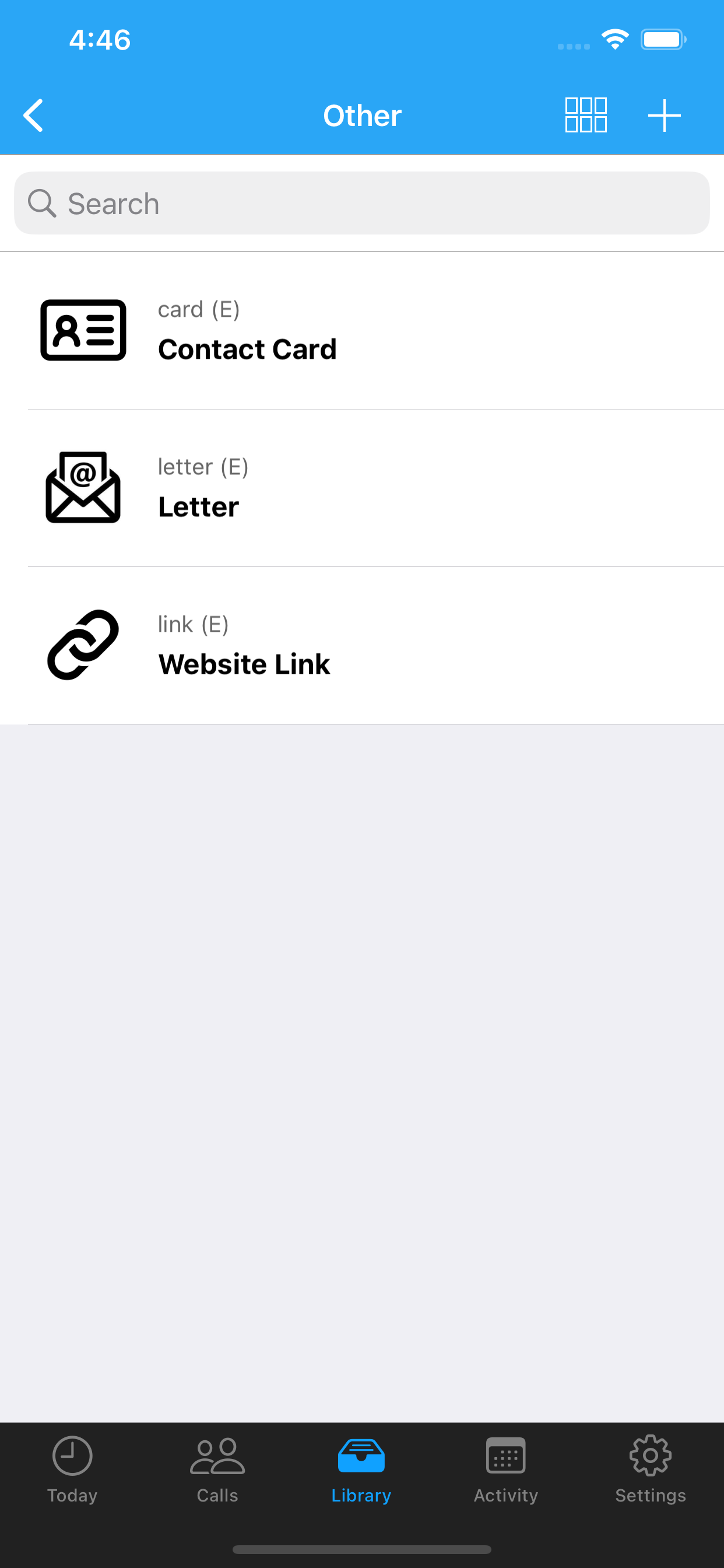
- There are also some generic publications added into the “Other” section – a Contact Card, a Letter, a Website Link.
- Some generic videos are also available. These are mainly to demonstrate that you do not need to add in every single video you show householders. You can just add a generic video to start reporting videos shown.
- Note: the generic videos include some default cover artwork – these are royalty free images courtesy of Unsplash.
- Existing users will be asked if they want to install these default publications and videos only if that Library section is currently empty. Otherwise they can long-press on the “+” button in the top/right toolbar and they will be asked if they want to add these new items to their existing Library.
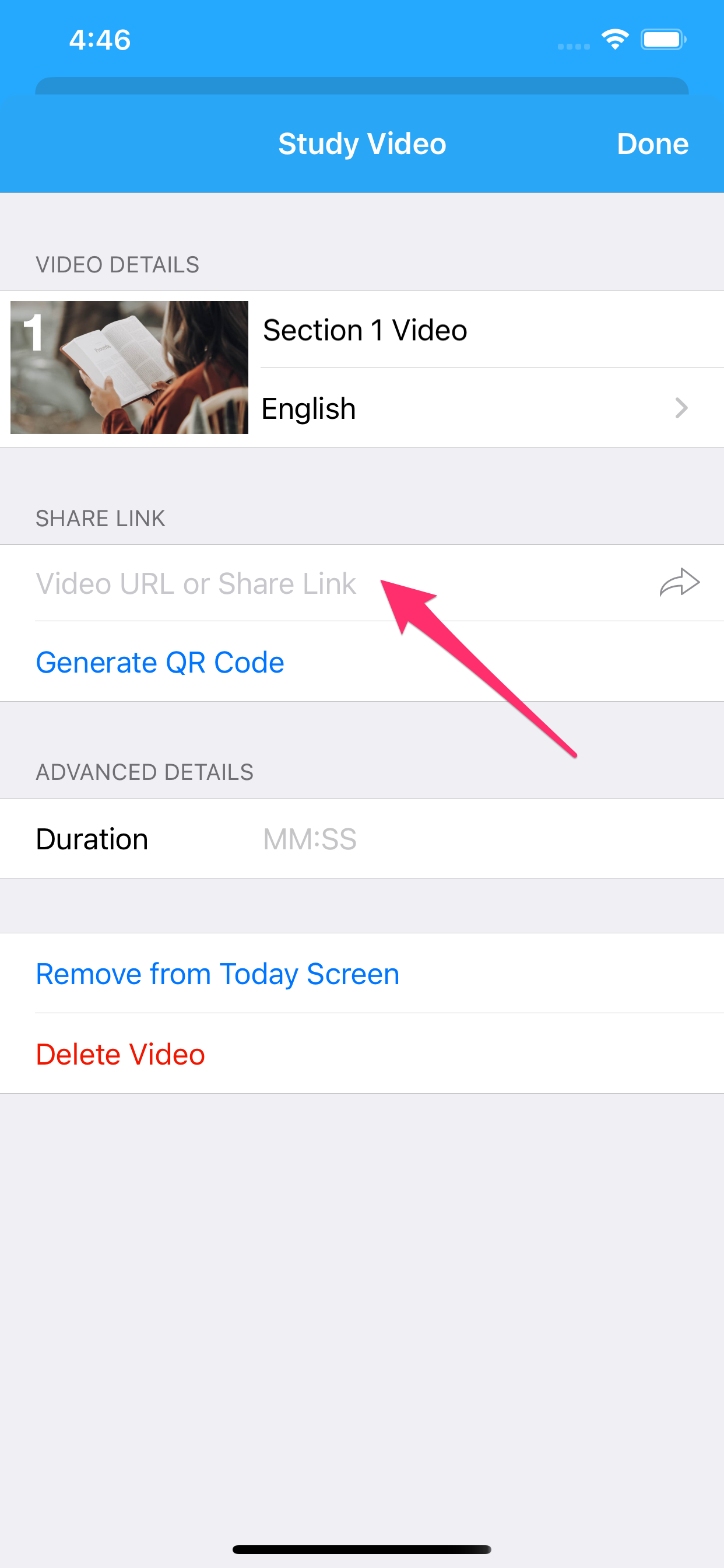
- I have removed the 4x fields for video urls to play or stream. If you have already populated these fields for your existing videos, then they will still show. But when you add any new videos from now on, these fields will not be available.
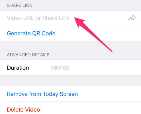
Some of these changes, especially around the videos, may sound frustrating at first. But not for long. Instead switch focus to populating the “Share Link” / URL field for each video (see last screenshot above). You can link to either the video on the official website – or even better, use the Share Link from inside JW Library. ServicePlanner will then use the link to open JW Library and play the video from there. This will stream the video if you are online, or play the video offline if you have downloaded the video in JW Library already. And you get all the advantages of the enhanced video controls in the official app.
Other Improvements
There was a lot of work done to the underpinnings of ServicePlanner – the stuff you can’t see, but it makes a difference.
- A number of improvements to the Dropbox Sync. Most users don’t have any issues with the sync, but some have from time to time. I hope the new controls in place will limit issues, and if you have any please reach out as I have better tooling in place to try and isolate what went wrong.
- The Home Screen app icon shortcut used to be enabled for devices with 3D Force Touch, but is now enabled for Haptic Touch. Basically this means that the app icon shortcuts should now work on all devices. Give it a go. Long press on the ServicePlanner app icon to see the menu options.
- Many users don’t make a “Manual Backup” – but they should. I have changed the default settings to remind users to backup every 60 days. You can change this default option in Settings > Manual Backup.
- The app is now fully translated into Chinese Traditional and Simplified! A big thanks to the efforts of our brother here.
- The Bible Studies showing on the Activity Year tab are now limited to unique persons studied with throughout the year – as opposed to a total of the reported Bible Studies per month.
- There are new icons used in different areas of the app to give the UI a general “refresh”.
Ok so I am impressed that you made it to here. I am exhausted just typing this blog post 😴. Never mind the hours that went into version 3.0. I hope it works smoothly for you. But as with any changes made to an app, some things can be missed, so please just reach out and let me know of anything you notice.
And of course, if you are enjoying ServicePlanner, I would be really grateful to hear your feedback. And your review on the App Store would be greatly appreciated!
Thanks again for your ongoing support and enthusiasm for ServicePlanner.


